PAN Fans Club

Let's talk about PAN paperbacks, the blog for those that do judge a book by its cover. Main site is at www.tikit.net or www.panfans.club

PAN Fans Club - Let's talk about PAN paperbacks, the blog for those that do judge a book by its cover. Main site is at  www.tikit.net or www.panfans.club

Cartland Bantam versus PAN & Happy Birthday to my Wife

Looking at a few of the Bantam covers of Barbara Cartland novels shows they used the same artwork as PAN for some titles and very similar images for others. I’ve put a random selection HERE. It’s interesting to see how many different styles Bantam used while PAN was consistent over the 18 or so years they published Cartland titles.

On a different note it is my wife’s Birthday tomorrow and as she is a Robinson Crusoe fan I’ve got her some original artwork and had it framed. It was coincidence that while looking through some Readers Digest Condensed Books (see previous blog) I saw ‘Robinson Crusoe’ with artwork by Jack McCarthy which I ignored as he didn’t do work for PAN as far as I can ascertain. It was a couple of days later that a message popped up on eBay, while I was looking at something completely different, saying I might be interested in some artwork which turned out to be the original for the frontispiece. Needless to say I bought it along with another McCarthy which I presume is the front cover of another ‘Best Loved Books’ I’m guessing the legionnaires could be ‘Beau Gest’ but the other parts don’t go with the only copy of the book I can find as it is a US version and the UK ones had different sets of titles. Does anyone know of a copy as below?RD

Ron or Josh Kirby?

I was in communication with Derek Stowe recently as I had picked up a copy of Peter Benchley’s “The Island” from 1980 which has a cover credited to a Ron Kirby but is there more than one?The Island Now I know Josh Kirby’s name was really Ronald and Derek mentioned working with him in the mid 50’s on “Authentic Science Fiction Monthly” Derek said

“Yes, my friend Ron Kirby was known by many as ‘Josh’. He was an incredible intelligent guy – always interested in the ‘The other World’ the world of the fantastic. Among other things he was always wary of cats as he believed that they made you stroke them to gather electricity for the Moon! He acquired the nickname ‘Josh’ while studying at the Liverpool City School of Art. He said ” Some wag thought I painted like Sir Joshua Reynolds” He thought that his first paperback was a PAN in 1956 of Ian Fleming’s MOONRAKER, and first magazine cover was for the Authentic Science Fiction Monthly ( March 1957) illustrating a book by Douglas West – Dead Weight. His official list of covers runs to more than 400. For all his vauge and dreamy personality, he was a great influence on me – he seemed to always know the answer to life”

I have all of the 6 covers Ron/Josh did for “Authentic Science” and they can be seen if you click HERE while the 2/3(?) painted by Derek can be seen HERE.

More Julian May Covers from Stephen Bradbury + Others

ReflectionsIn the book “Reflections: The Art Of Stephen Bradbury” published by Paper Tiger in 1996 can be found the original artwork for the covers for “The Saga of the Exiles” series where Stephen tells of his meeting with Gary Day-Ellison and how lucky he was to get the commission as it was Friday and “Gary didn’t see anybody on a Friday” His obvious disappointment softened the secretary’s heart, he had five minutes to show his portfolio anf the rest is history as they say. After the “Exiles” covers he went on to do the four covers in the “Galactic Milieu” series, namely “Intervention”, “Jack the Bodiless”, “Diamond Mask” and “Magnificat” The eight covers are linked in that the angel in “Magnificat” metamorphoses back into the skull on the cover of “The Many Coloured Land”
CoverCycleI have now added several more covers of various dates to my original Julian May PAN Books page including some of the American titles Stephen mentioned saying “If you see the American covers for the same series, they are a bit cringeworthy” Dare I say I quite like some of them especially “Adversary” from 1983. It is also interesting to see the later PAN editions from 1994 onwards where the artwork is spoilt by being squashed to fit a format for which they were not intended.

Julian May “Saga of the Exiles” Stephen Bradbury Covers

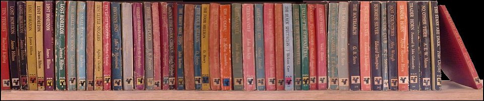
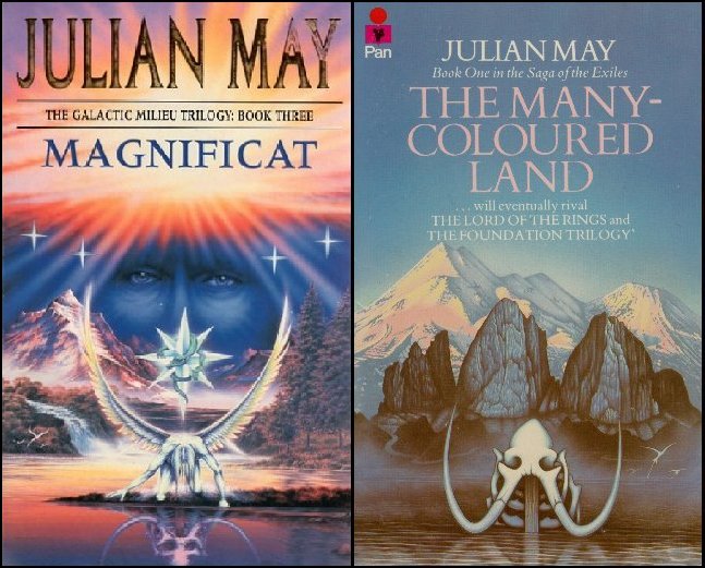
Between 1982 and 1984 PAN printed the four titles in the Julian May “Saga of the Exiles series namely “The Many Coloured Land”, “The Golden Torc”, The Non-Born King” and “The Adversary”. They all had covers in a similar style by the artist Stephen Bradbury. If you put the covers side by side you’ll find that the images do not quite join together whereas on the outside of the 1983 (first 3 titles) and 1984 (all 4 titles) boxed sets they do which prompted me to contact Stephen Bradbury and he kindly replied and said

Stephen BradburyHi Tim, Thanks for your email.
The answer to your question is, the artworks were painted separately over a period of years. Gary (Day-Ellison) and I basically decided to keep the central horizon about the same level with each painting. We knew it was going to be a series, so we developed a ‘series look’ to the jackets from day one. The overall use of slightly different blue colours was a conscious thing. The success of the series blew us away, so I think by book 3, “The Non-Born King”, the marketing department decided to photographically merge the artworks. They were initially used this way on large billboards and giant posters, which I have copies of. The same trick was used when book 4 “The Adversary” came out. The large billboards looked quite dramatic. Each Julian May book got high in to the top ten , in the book charts. It was a great success for Gary, myself and Pan Books.

This was followed by “Intervention”, “Jack the Bodiless”, “Diamond Mask” and “Magnificat” They were a few years later, and I decided use faces of the characters in the sky. I knew the pages of the last book, “Magnificat” go right back to the beginning of “The Many Coloured Land”, so I contrived to get the artwork to do the same trick ! Overall, I tied to keep the artwork for the series quite elusive ! To draw people in, but not give anything away about the stories. It seemed to work. Intervention, is just that ! An eagle flying along , suddenly is intervened with. An intervention, unlooked for. I did this with all the covers  Quite surreal, and quite sophisticated , for the time. 

If you see the American covers for the same series, they are a bit cringeworthy. Gary and I really did create a magical format. I have the boxed set , you mentioned, and yes, they were linked by photographic means. The Many Coloured Land was my first book cover, and I will always be eternally grateful to Gary for giving me my first book  cover  and my first break in to illustration and publishing. I wouldn’t be here now, if it wasn’t for Gary.. He has great insight.

I hope that answers your question Tim. Use my email address to contact me.

Keep in touch

Stephen

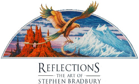
I greatly admire Stephen’s work and will be adding more covers in the next few weeks. From reading reviews the books were very well received but from the excellent condition of both of my boxed sets these books appear to have never been removed!

A bit more from George and getting paid twice?

Following on from my reference to how the painting for “Testament” by George Sharp was turned upside down I also found the same image used by Chatto and Windus for their hardback edition. The gun is again shown in yet another position to the original and George tells me he didn’t get paid for this edition! “First Blood” from 1973 has a cover in a very similar style but George says it is not his and I can’t find a name as yet.

I often wonder if it was the case with other covers that artists didn’t get paid twice especially ones like the Shute series from 1974 by Roger Coleman when they were used in the USA by Ballantine with whom PAN, I think, had a link through Ian and Betty Ballantine (Ian Ballantine was connected with Penguin in the late 40’s but there was a falling out)BiroAnother series where the same covers appeared on the UK and USA editions are titles by Jean Plaidy used by PAN in the 60/70’s and by Putnams in the 70’s. I’ve put a few HERE. I can find no reference to a cover artist for PAN editions so I bought the hardback Putnam edition of ‘Murder Most Royal’ as US publisher usually credit the artist but unfortunately not in this case. Does anyone know who he/she/they might be? The shield above appears on the title page of the PAN Plaidy “Stuart Series” and is by the late PAN cover stalwart Val Biro.

The PAN Book of Card Games by Hubert Phillips

A while ago I was tempted by an item on eBay namely a copy of “The PAN Book of Card Games” from 1960 which appeared to be hollowed out to give a secret compartment. I was wondering if this was an amateur job but quite the reverse. The seller told me her husband was a sales rep for PAN in the 50/60’s and he gave these away as a novelty including two packs of cards. Unfortunately mine didn’t so I’m showing it with a couple of packs of a later date but if anyone does have a contemporary set then I’d love to hear from you. I did wonder if the cards were the ones shown on the back cover of the book but on trying my packs found they were too big. These cards were printed by the Thomas de la Rue printing company in 1957 for their 125th anniversary and the First International Playing Card Week. The designs are by the French tapestry designer Jean Picart le Doux. I see someone is asking $1200 for a couple of packs on eBay.com so I’d better take more care of mine! I’m hoping to met up with the rep in Chepstow later in the year as he says he has some PAN related photos from his time working for them but he wants to remain anonymous.

The artwork for the book is by Glenn Steward who began working as a book cover artist in 1957 and worked for several firms including Digit Books (1957) and Panther (1958) and then PAN Books producing nearly 150 covers in six years although he continued to work for Pan until at least 1968. According to Simon Marsh-Devine he was still working in 1994 but I can find nothing after this time. As usual if anyone can add any further information I love to hear from you.

I’ve also added another screen capture to the ‘As Seen on TV’ section as the opening credits for the series “Put Your Money Where Your Mouth Is” shows one of the presenters, Philip Serrell, standing in front of a book case with at least three PANs in it. I can definitely identify two X86 “The Intruder”and X434 “YOLT” but not the sixth from the right as it is newer than the others. If you click on the picture below you should be able to see it but it’s not as clear as I would like. My guess is ‘Majipoor Chronicles’ by Robert Silverberg with the Josh Kirby cover from 1983?Put your Money 2

Daphne du Maurier

NamePAN published fourteen fiction and four non-fiction titles by Daphne du Maurier. I have added 33 different covers HERE and I am still trying to track down more images I’ve seen on sites but which were too small to use . I have included a few covers from the net although my usual rule is I have to have the cover to include it but I have ended up with so many duplicates as trying to work out dates/printings/editions etc. is very difficult plus sellers are not always as cooperative as they could be with providing scans. I hope to replace them with scans of my own as I track them down. I’m not 100% sure of the dates of some of the ones on the page so if anyone can help or put a name to the anonymous covers please let me know.

Caroline Binch

A couple of the covers are by Caroline Binch who kindly replied to my email but we think she only did the two as shown although Caroline did other titles for PAN and I’m hoping she’ll let me know what they were. Other familiar names are Gino D’Achille, Roger Coleman and George Sharp.

“Spotlight On ………..” Series

LanguageSeriesIn 1981 PAN decided to bring out a series of four books titled ‘Spotlight On ….” French, German, Italian and Spanish. The format was that they contained clippings from advertisements, newspapers, cartoons, instruction manuals, books etc. all in the language of that particular title. What makes them a little different was that, although using the same format of  representative everyday items of that country on a coffee table, all the covers are by different artists. The Creative Director at the time was Gary Day-Ellison and he contacted four graduates from the Royal College of Art in London to paint the covers which apparently had to be done in a bit of a rush.

I decided to see if the artists are still at work and managed to contact three of the four namely Russell Mills, Chloe Cheese and Cathie Felstead who all kindly replied (are you out there Gary McCarver?)

Russell painted at least six covers for PAN and I’ve tracked down five so if I can’t find the missing one I’ll put up the others next week.

15th Birthday, Jack Hayes and Barbara Cartland

We’re raising the flag to celebrate
the fact that www.tikit.net
will be 15 years old tomorrow.

Flags

By Hayes, not for PAN but Hamlyn. the cover of ‘Flags’

Hanging on my wall for many years have been a couple of original covers by Jack Hayes, fortunately both signed, of two titles from the ‘Captain Blood’ series by Rafael Sabatini. This made me look to see how many other covers he painted for PAN and with the two already mentioned I make it seven.
One thing I have not managed to find out is any real details of his life, DoB, death etc. so if anyone can help?

Having succumbed to a mad ‘bulk buy’ of Barbara Cartland titles I am now up to 94, all scanned and bookmarked on the site but never again! I may see if I can find a few more to get to 100 but I don’t think I’m inclined to be a completest this time even if it meant I could find out if “A Kiss From A Stranger” was the only one with the PAN logo bottom right instead of top left like all the others so far!
NB With so many images on one page it does take a while to load!

Updates Today

Having been away in Croatian for the last two weeks I’m glad to see the schedules I set up to publish the blogs each Monday while away seems to have worked.

There are five pages which have been updated this morning from books that came during that time;

1) I have scanned another couple of Carbara Cartland covers which currently stands at 42 out of 125 and I will add more as I come across them.

2) I have managed to find a PAN copy of the Frank Yerby title “The Treasure of Pleasant Valley” and have added that to the page of other Yerby covers.

3) Back in 2102 I visited the building that was once used as a despatch centre by PAN. David the owner said they were going to have it clad in aluminium so I’m grateful to my agent Martin in West Molesey for taking a photo that I’ve now added to the page. Improvement?

4) While looking for information of Val Biro I came across this in ‘The Telegraph’: “There was great rejoicing some months ago when it emerged that House of Stratus was to republish the complete set of Anthony Buckeridge’s Jennings novels. The first batch of three, though, hasn’t met with the author’s complete approval. Specifically, he hates the covers. “Jennings looks fat and shapeless, like a little gargoyle,” he says. “They completely missed the essence of what 11-year-old boys are like.” Buckeridge would have preferred to see the new books illustrated by Val Biro, the Hungarian-born illustrator who worked on the original books. “It came down to money,” he says, “and Stratus ended up using an in-house illustrator.” Even though it’s not PAN I’ve added an example of a Val Biro Jennings cover to his page

5) Not PAN but Panther. I spotted a scrawl on the bottom of a Panther title on eBay which I thought look like the top of the name Derek A Stowe. I then found another copy on an Australian booksellers site (which would have cost me 12 times what I paid with the postage they were asking) with a photo which confirmed it was a Stowe. This just shows how carefully you have to look at covers to find signatures as they were often removed in the trimming process.

Bamboo4
“Bamboo, Rice and Seaweed” Panther 778 1958