First blog since upgrading to Windows 10 – so far so good!
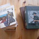
I mentioned in the last blog I was trying to contact an artist, namely Alan Cracknell, but no success so far but then again I may not have the right one. The artwork this time features his interpretation of that famous character form Enid Blyton “Mr Twiddle” in “Hello Mr. Twiddle” There were three titles in this series but only two were published by PAN under the Piccolo imprint who didn’t include “Don’t Be Silly Mr. Twiddle” I’ve also included a couple of his other Blyton covers. I’ll put on another piece of his artwork soon.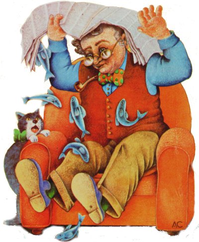 Alan was born in Harrow in 1937 and attended art school before working as an illustrator in advertising in London eventually became freelance.
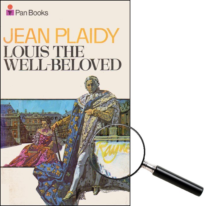
“His beautifully detailed artwork influenced by Russian Icons and Medieval miniatures incorporates Nursery Rhyme Characters, Flora and Fauna, Field names and Artifacts in a surreal manner into his work. Medieval meets Alice in Wonderland” (Bell Fine Arts)
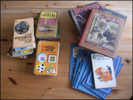
I meant to include this cutting last month when it actually appeared but it went missing and turned up a bit ripped!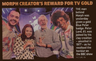 Pan published three Morph titles under the Piccolo imprint where Tony Hart is shown on the covers but it is Peter Lord who is credited inside.
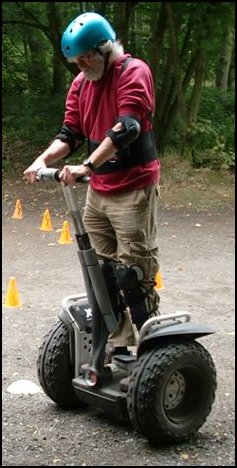
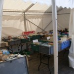
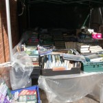
Mastering the beast before being let loose in the woods.
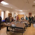
….. and finally, although this is probably ‘old hat’ to all of you and for once nothing to do with books I got around to having a ‘Segway Experience’ last week. I was quite pleased, for once, to be told off for going too fast around the corners but as I didn’t crash into anything or fall off I thought I’d mastered it pretty well!